When facing a difficult decision with no clear easy answers, our brains use heuristics, or mental short-cuts to reduce the choices down to things we more easily understand. Our brains do this by categorizing the choices into groups. How we assign the groups is based on our knowledge, experience, and understanding of the topic. All of these can be easily swayed by our emotions.
Let's take a look at SEM's recent questionnaire sent to our advisors & clients:
1. Which power source is more dangerous? Nuclear OR Coal
Most people select "nuclear". Our brains more easily summon images of atomic bomb clouds and nuclear power plant meltdowns. The data however says coal-based power is far more dangerous. We of course would have to go find the data and look at it with an open mind to find the correct answer.
Coal-based power not only contributes to outdoor air pollution, but it leads to 15 times as many accidental deaths as nuclear energy. Added to that, according to the World Health Organization air pollution now accounts for one of every eight deaths in the world.
SOURCE: Denying to the Grave, Gorman and Gorman, 2017
While the above question is some fun trivia, the next problem is something both advisors and individual investors face often. How do you select your investments from lists that are often very long and include a limited amount of data for you to base your decisions on?
Most of the time we have limited data such as this. We added standard deviation, which is a measure of volatility. Oftentimes you are not even given this number so you have no idea how to determine which option might be more or less risky.
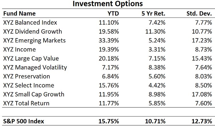
2. Which of the funds listed do you think will have the least amount of risk?
3. Which of the funds listed do you think will have the most amount of risk?
How you assess these options depends on your level of investment knowledge, your personal experiences with investments, and some general rules of thumb. Some will only look at the name of the fund, using their idea of what each fund means in terms of risk. Others will look at the returns versus the S&P and assume the lower returning funds have the lowest risk and the higher returning ones have the most risk. Some may also look at the standard deviation (volatility) of the fund.
Regardless of the method, it is nearly impossible to get this answer right both here and in the real world.
There are lots of way to measure "risk", but to us it's always come down to how much did you lose. While we prefer "maximum drawdown" as the primary risk metric (drop from highest value to lowest value), the easiest number to get out of Morningstar is "worst 3 months". In our experience this is 'good enough' when determining how much risk an investment has had historically, especially when comparing to other investments.
Before we look at the actual risks of the funds above, it is important to understand the data is not fictional. The year-to-date, 5-year annualized returns, & standard deviation numbers were pulled from Morningstar just before the financial crisis hit. In other words, those were numbers real-world advisors and investors would have been using to make their investment decisions. The names were changed to XYZ to protect the innocent (or in this case guilty).
So how did you do in determining the lowest and highest risk investments? Check out this chart which shows the worst 3 months AFTER the data above was compiled:
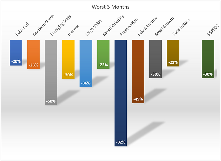
The lowest risk funds were:
- Balanced
- Total Return
- Managed Volatility
The highest risk funds were:
- Preservation
- Emerging Markets
- Select Income
How many did you get right? I know most of us who were surprised at where some of the funds showed up on the list.
Let's take a look at a few of them.
Lowest Risk Funds
Bonds are supposed to be low risk, so it is a surprise to not see any income funds show up in the top 3. Even more surprising is the Balanced fund showing up as the lowest risk fund since most balanced funds have 50-70% of their investments in stocks. This particular balanced fund was only 40% stocks, with an overweight position in large cap "value" stocks. The bond portion was also invested in lower risk Treasury bonds rather than higher risk corporate or emerging market bonds. The only heuristic that may have helped would have been looking at standard deviation (not always available on most investment lists).
Total Return and Managed Volatility funds come in all varieties. The two funds in this list put a heavier focus in lowering the volatility of their investments. Others can have extremely high risks, so you should be especially cautious when selecting funds with this in the name.
The biggest surprise is the lack of income funds on the low risk rankings. Most of us believe an "income" fund would be on the lower risk scale. Remember, income funds could be comprised of bonds or dividend paying stocks. The bond market is vast and just because a stock pays a dividend does not mean it is "lower risk". The Income & Select Income funds available ended up losing as much or more than the S&P 500. The Income fund is 75% bonds, but they are all low quality (high risk) bonds. The Select Income fund is 50% stocks and 50% bonds, but the bonds were "convertible bonds", which at times can have the same characteristics as small cap stocks (again very high risk).
Highest Risk Funds
We already discussed the Select Income fund, which was the third riskiest fund in the group. Emerging Markets are typically one of the riskiest investment categories available, so it is not a surprise to see it as the 2nd most risky fund on the list. The biggest surprise is the Preservation fund being the most risky.
None of the typical heuristics would have worked to avoid selecting this fund as a low risk option for your portfolio. You'd think the name Preservation would mean it actually preserved your capital. While that is an often cited goal, we've seen "capital preservation" funds often lose more than the S&P 500 at times. Of all the funds available, this fund also had the lowest returns which would lead you to believe it was a lower risk fund (typically the higher the returns, the higher the risk). Finally, it was on the lower end of the volatility scale.....until it collapsed.
You would have had to dig into the underlying portfolio of this fund in order to understand how much risk was in the fund. You would have seen a bunch of derivatives contracts. From there you would have had to somehow realize the derivative positions were "naked" or not "hedged", meaning if the market went against their positions too quickly the fund would have extremely high losses. This is what happened to this particular fund in 2018. The "worst 3 months" was actually a 2-day loss of 82% before the fund shutdown.
While this is an extreme example, we see fund names not come anywhere near describing what type of risk you are taking. An Income fund losing 50% of its value is not what we would expect, but it has happened far too many times. The moral of the story is to not judge a book by its cover.
Selecting an investment portfolio is not easy. Even with today's free tools available online, finding out what lies beneath a fund's name takes work, experience, and an understanding of how the portfolio actually functions.
Whether you are an advisor or individual investor, if you scored below 84% on this test, it's probably worth having a conversation about ways SEM could help you overcome your personal biases.